
I see many organizations making significant strides in embracing tools & platforms that allow you to turn data into insights. Power BI is probably the most well-known, as it allows you to easily develop good-looking reports & dashboards.
Yet I find that the use of Power BI often lingers with the IT department and – if you’re lucky – with the project team in charge of implementing it. Real use within the rest of the organization often lags behind, and that’s a shame. After all, the goal is to enable the entire organization to create its own reports and perform analysis. So the promise of “self-service analytics” is often not fulfilled.
A missed opportunity, because if you use Power BI properly, it can provide a huge boost in actually working data-driven within your organization. In this blog, I explain 3 steps to ensure that the use of Power BI grows throughout your organization.
Guaranteed
.
Step # 1: Data literacy
Invest in your employees’ data literacy . Data literacy, like many other terms, has many definitions. We use the following definition from Gartner:
”
Gartnerdefines data literacy as the ability to read, write and communicate data in context, including an understanding of data sources and constructs, analytical methods and techniques applied, and the ability to describe the use case, application and resulting value.”
A Data Literacy Guide For D&A Leaders (gartner.com)
By data literacy, we mean the ability to work with the data that is made available and be able to use the insights. By making it part of the decisions you make during your daily work.
Based on what I see with clients, it is important to give adequate attention to the following issues from the get-go:
- Understanding the data journey: from source application to report. It is important to recognize the “journey” data takes from source to report. Understanding the data journey provides an understanding of the well-known saying “Garbage in = Garbage out” and what influence you have on it. .
- The context of what you see: make sure every user of a report knows what they are looking at and that they can read & interpret graphs. Use unambiguous definitions, record which source the data comes from and who you can contact if you want to know more about this data. More on this later under data discoverability.
- Power BI training: Learn how to properly use, analyze and visualize available data in Power BI. It is also best to learn this with data that appeals to you. Data from your own organization or for example data that you recognize yourself. I myself often use Strava data or the transactions of my bank account.
- Select “data champions” within your departments. These are people with passion for data and with enthusiasm to share it. They help colleagues in an approachable way with their first questions and are an accessible way to spread data literacy. In addition, they inspire with their passion and enthusiasm which leads to more use of Power BI.
Step #2: Data quality
If data quality is not in order, it will certainly lead to discussion and the organization will lose confidence in what is shown in reports. At worst, it can even be dangerous if decisions are made based on insights that are incorrect.
Data quality has a number of properties as depicted in below. Too many to cover them all in this blog but I want to share with you that it goes beyond what we are currently focusing on:
The influence the business has in data quality
.
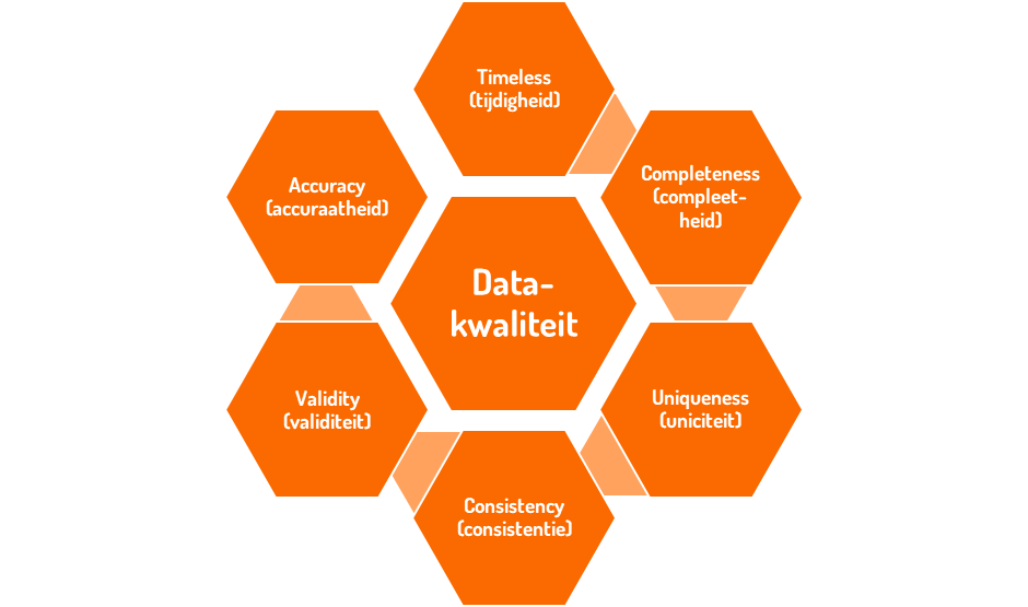
Securing data quality requires a structural process . This is an essential part of your data management. As with anything, technology is available to help you with the issue of data quality. However, it is crucial that data quality is a responsibility of the business and not the IT department. IT helps in mapping and monitoring data quality (tools and technology), however, solving it lies with the business. The reason behind this is that the business has influence over data input. Thus, they not only have an interest in better data quality but also the influence to adjust it. Garbage in = Garbage out can be broken here.
Make sure that securing data quality is a topic on your data agenda from the beginning. Develop data quality checks that uncover issues and place the responsibility for following up with the business.
Step #3: Findability of the data
Findability of data ensures that people can find the right data on their own. When I share this with clients, I often hear responses like “Surely it makes sense where the data is” or “The name of the report already describes it.” And yes, it often makes sense to the project team as well. But we actually want greater adoption of what has been developed and-importantly-we want the right people to be able to find it without having to check with an IT department.
The most important step to take as an organization is to set up a
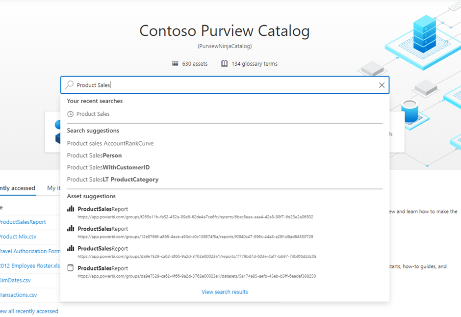
data catalog. A data catalog gives your organization insight into available data, how to interpret it, where to find it, where it is used, how it was created and who is responsible for it.
That’s quite a big and powerful statement. But this is the role the data catalog has. Let’s see step by step what I mean by it. In the figure below, you see an example of a data catalog in Microsoft Purview in which you can search the data in your organization through an interface similar to a search engine.
#1 Interpretation
By this I mean, in this context, the definition of your data. A lack within many organizations is having the definitions of data available. Something relatively simple like “Number of customers” can already have many meanings, depending on who you ask. Suppose you are an online retailer and you sell clothing. Does a customer then equal an address? Or is a customer equal to an email address? And are customers who haven’t bought anything for 12 months still part of your number of customers?
I think you get where I’m going with this. All answers are good if aligned and communicated. The data catalog is THE place to capture these definitions, describe them and state who is responsible for them. And that way you know how to interpret data and make it available to everyone.
#2 Data responsibility
The introduction to this can, of course, be read above. However, who is responsible for a definition does not necessarily equal the person who is responsible for the data itself. This role is often called the data steward. And to be honest, I think it’s more than a role, it’s actually a responsibility. Taking responsibility for the data, the quality, the documentation and keeping it up to date over time. Because we know who is responsible for specific data and definitions, you know where to go with questions and/or improvements.
#3 Findability
In the data catalog, you can use a “search engine” interface to find where data you need is located. As an example, let’s take an HR employee looking for absenteeism figures. This employee can search the data catalog for “absence”. The data catalog returns where absence data is located, in which report or in which Power BI dataset it can be found.
In addition to reports and data sets, you can also get back specific data points such as “% Absenteeism” or “% Long-term Absence.” Thanks to data stewards, here’s how to interpret these data and which ones you need.
If you have further questions about this data, you also know who the data steward is and can interact directly with this person, all without interference from your BI or IT department!
Need help making Power BI more impactful?
So do you want Power BI to truly become a tool of the organization and not stick with IT or the project team? Then the above points are a must as far as I am concerned.
share post